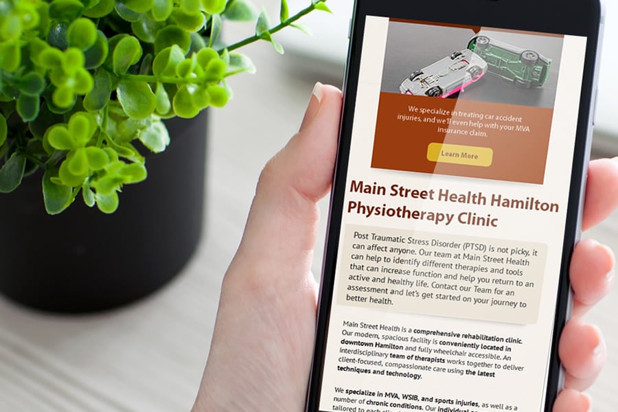
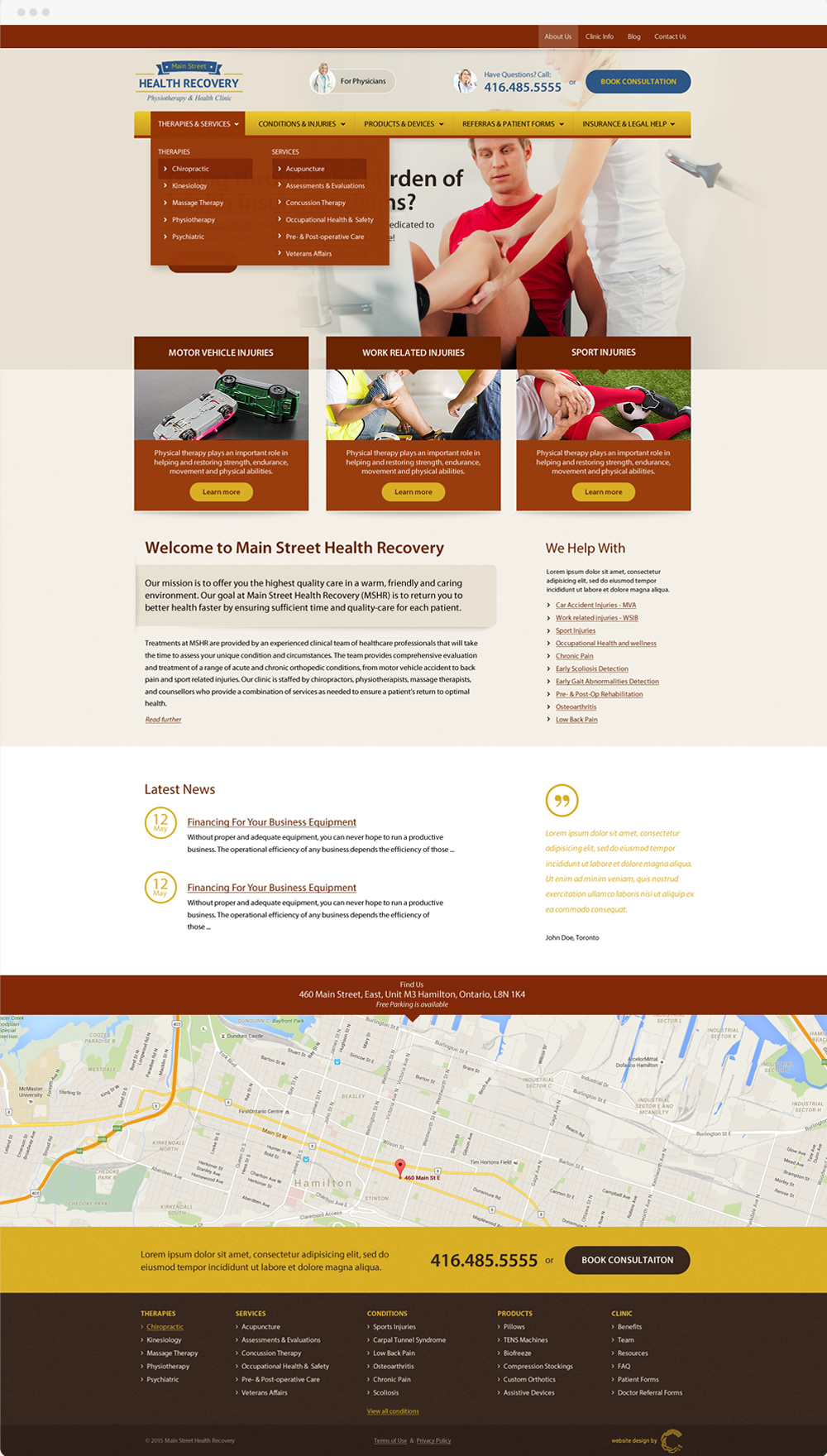
The clinic mainly focuses on rehabilitation and physical fitness, which is the reason it was decided to step away from the traditional white and blue layouts of most medical websites and go for something energizing, that spoke “Wellness” rather than “Medicine”. The soft beige background has a soothing effect that helps further emphasize the bold orange brown colours used in the menu and call to action buttons.
Website for Main Street Health
October 12, 2016
The primary goal of this website is to convey a feeling of vibrant energy and health, while guiding visitors to the relevant site areas where they would get all the information they require.
mainstreethealth.ca
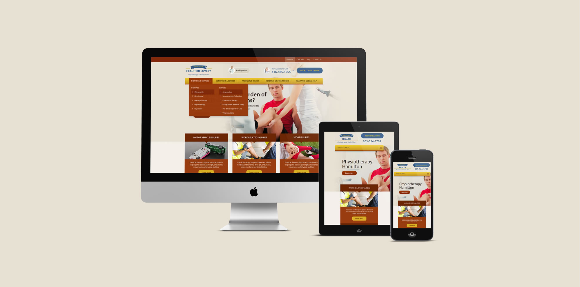


The site displays a lively, animated background display, integrated in a natural, non-imposing fashion into the header. The website functions as a marketing funnel, emphasizing the three main types of injuries in sections directly below the main banner, while the main menu offers access to detailed information on everything else the client may need to know.
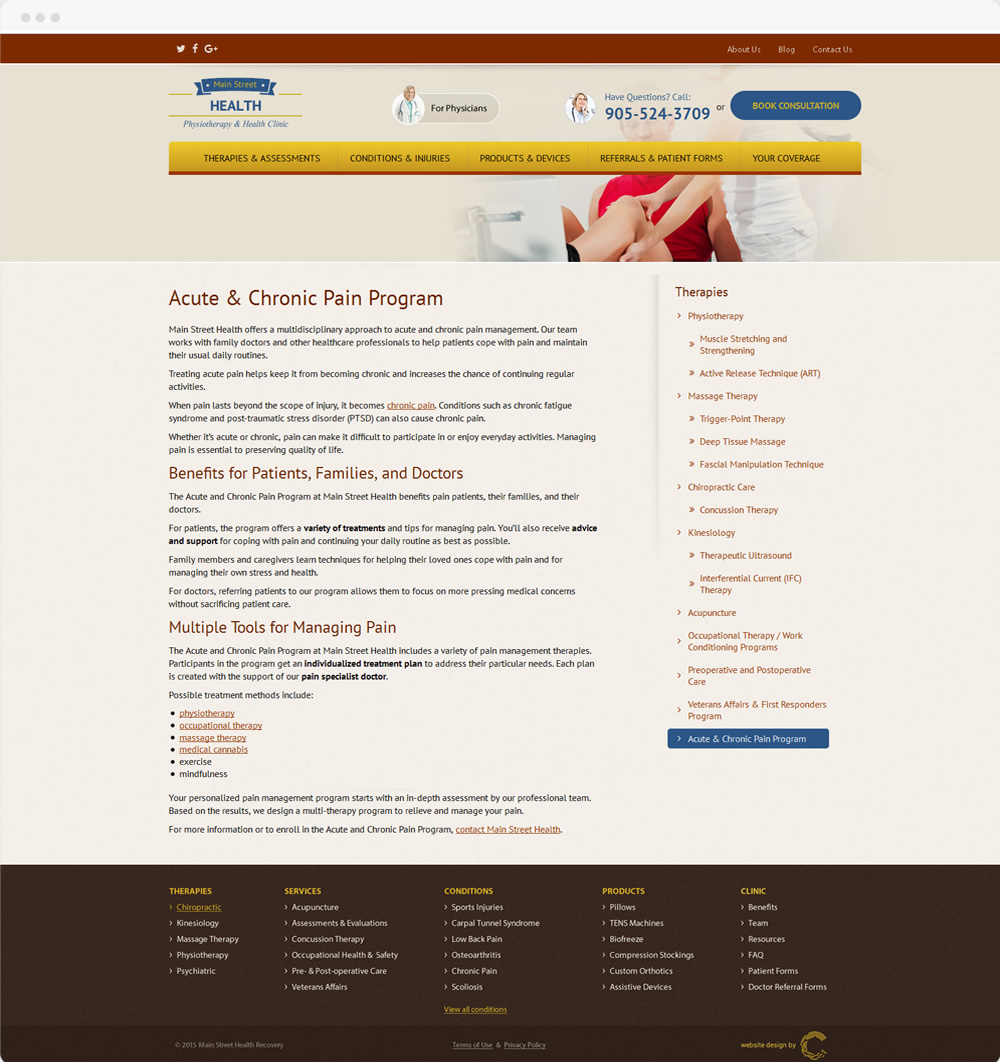
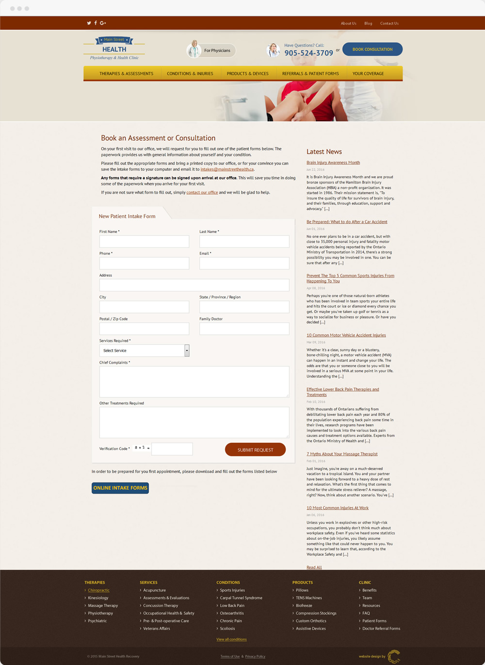
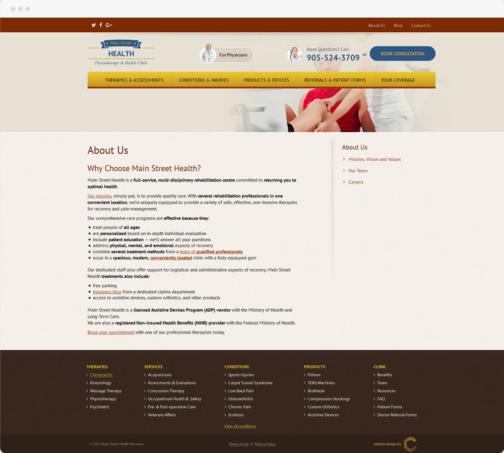
The result is a website with the combined atmosphere of a busy gym and a relaxing spa salon. A place where people feel at ease and find everything they need in the situation.
