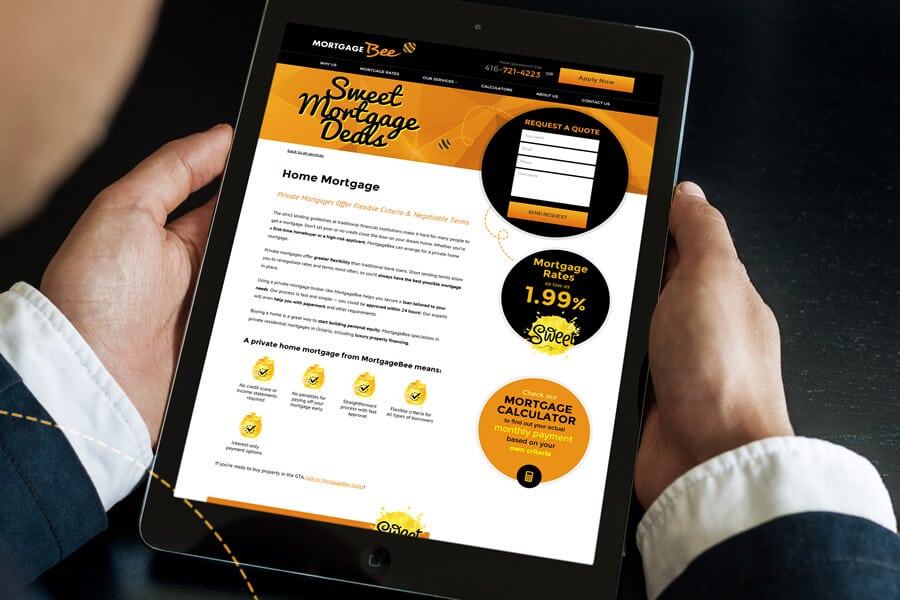
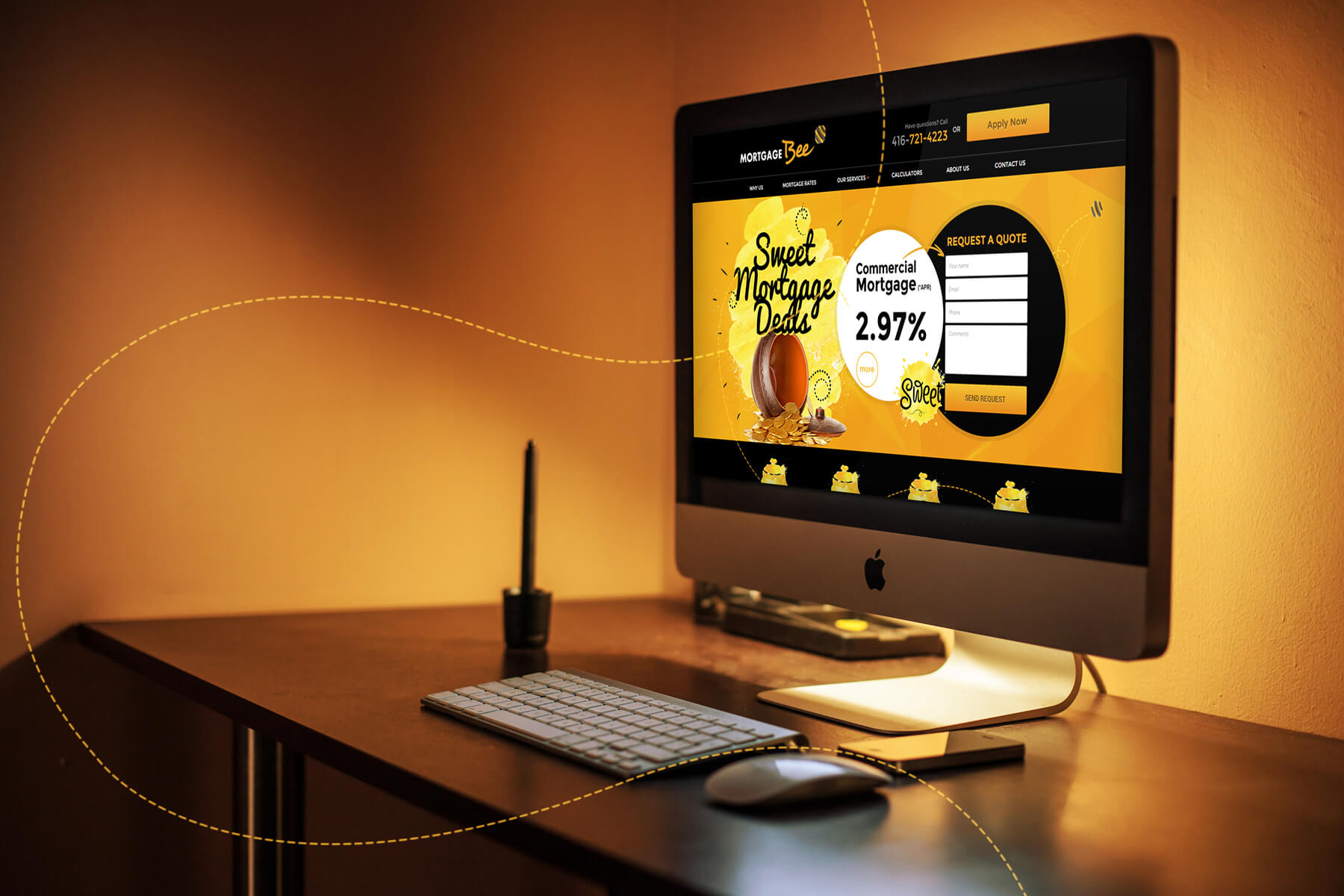
Black provides a strong background for the header, footer, and other key areas of the site. Golden yellow creates contrast against the black and together, the two evoke the distinct colouring of a bee. A warm orange tone grounds the site and is reminiscent of the rich, amber colouring of honey. Pops of white draw attention to menu items, fillable forms, and main content areas. The overall effect is bright and attractive without being overwhelming.
Website for MortgageBee
November 28, 2015
A new business in a crowded market, MortgageBee needed a brand that would stand out. Convergine developed the bee character as a quickly and highly recognizable logo that would distinguish MortgageBee and bring to mind their “sweet mortgage deals.” We then created a website based on the bee character to reinforce the brand.
www.mortgagebee.ca
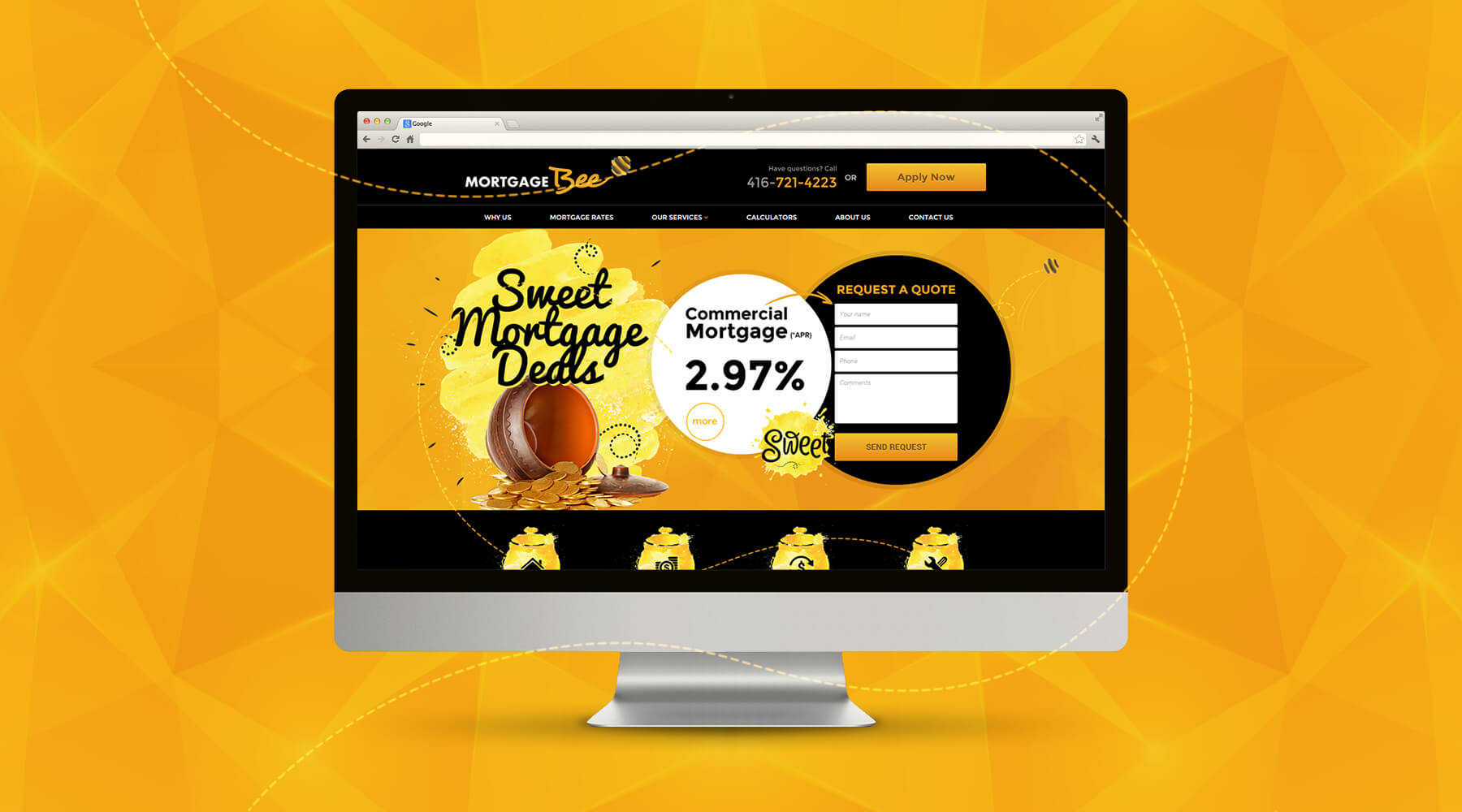

Circular callouts call to mind both coins and the cells of a hive, while loopy dotted lines evoke the flight of a bee and help lead the user’s eye down the page. Honey-pot icons signal key content, divided into easy-to-read chunks. Bolded text helps draw the user’s eye to key points, making content quick to read and understand. Black text on a warm orange background attracts attention to action buttons conveniently located throughout the page.
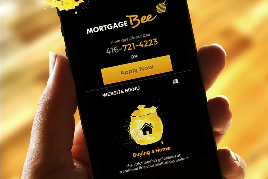
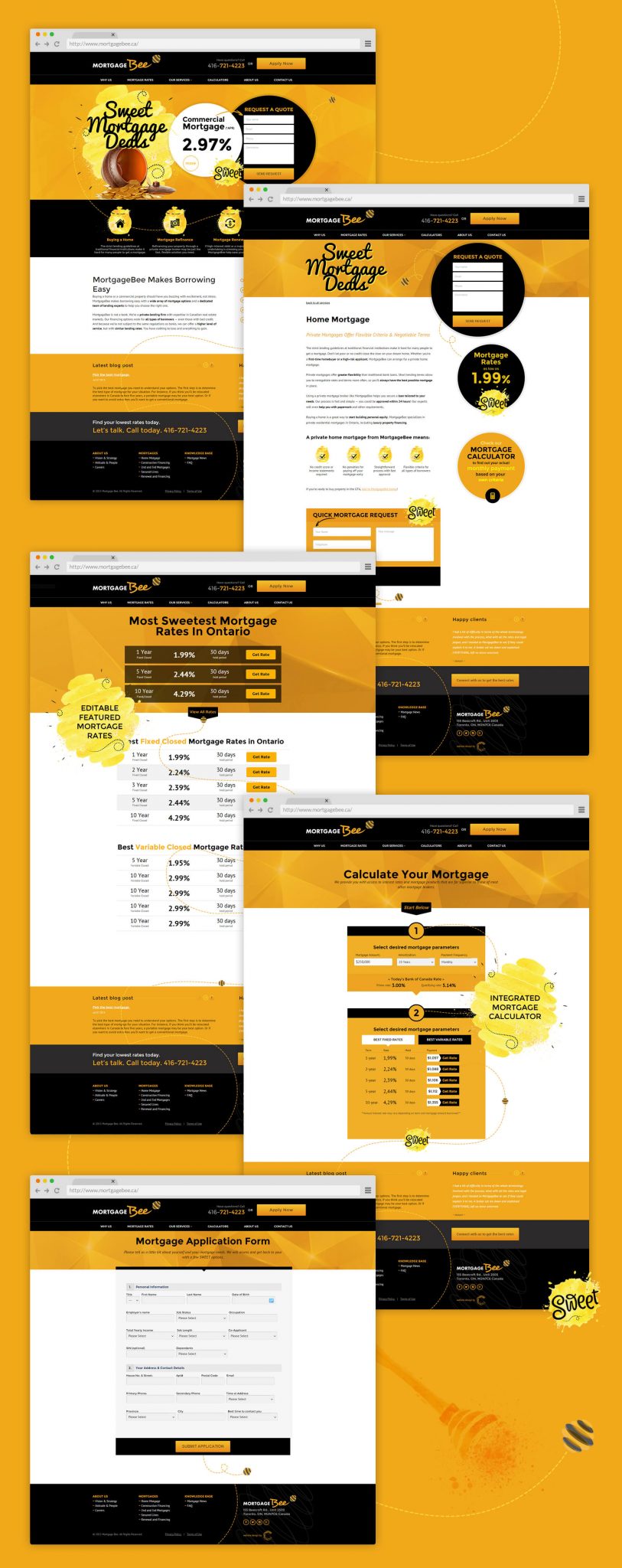

Rounding out the user-friendly design are interactive features like rate listings and mortgage calculators. These straightforward tools make it easy for users to engage with the content and help turn them into informed, qualified leads. An accessible drop-down menu in the header, as well as an assortment of in-text links, helps lead users through the content to various calls to action. The result is a highly usable site with great rates of conversion and return visitors.
