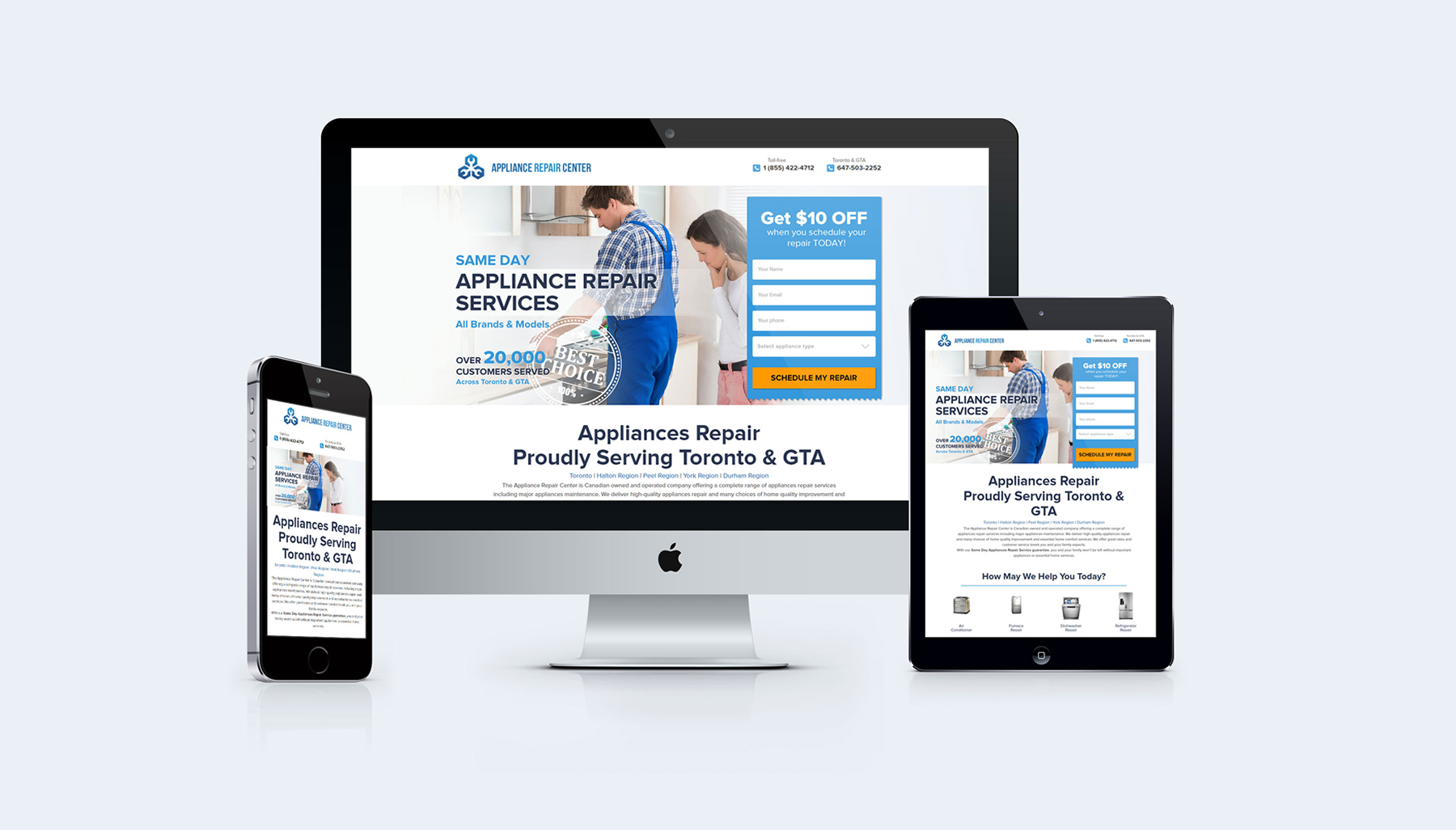
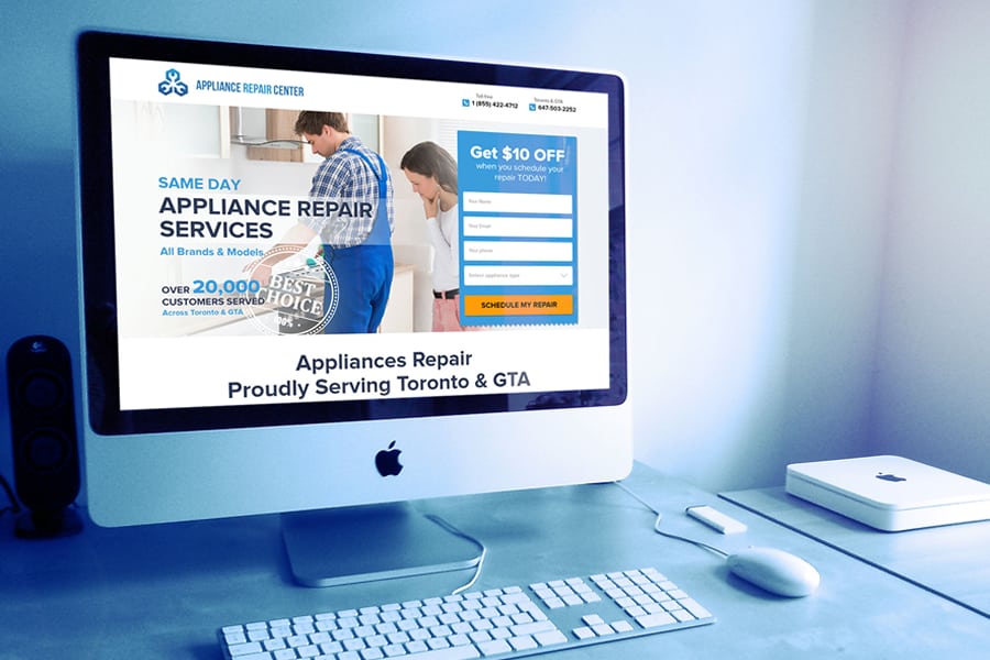
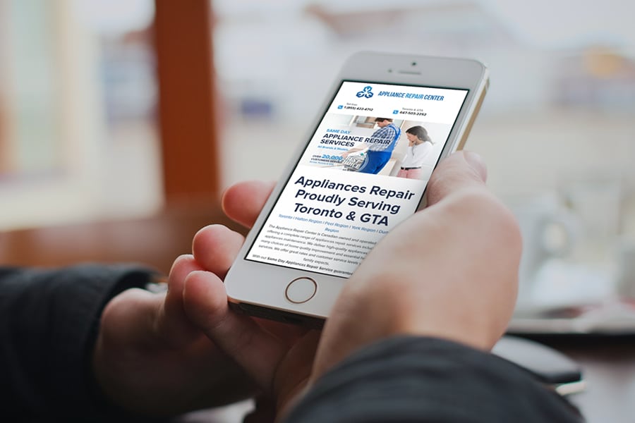
The information on it is structured in a manner that guides visitors to enter their details in the form and be contacted by a representative. The choice to use blue as the main color of the page, was made because it is a reassuring color, the color of cleanliness and order. It is the opposite of alarm or worry, which most people experience when a home appliance breaks down.
Website for Appliance Repair Master
February 25, 2015
This page is aimed at a clear marketing goal - collecting leads for the Appliance Repair company.
appliancerepaircenterinc.ca


The message is clear- you are in good hands, and we can take care of your problem. The contact form button – and the corresponding button in the bottom of the page – are the only two orange elements on the page. This makes them immediately stand out and catch the visitors’ attention, demanding immediate response.


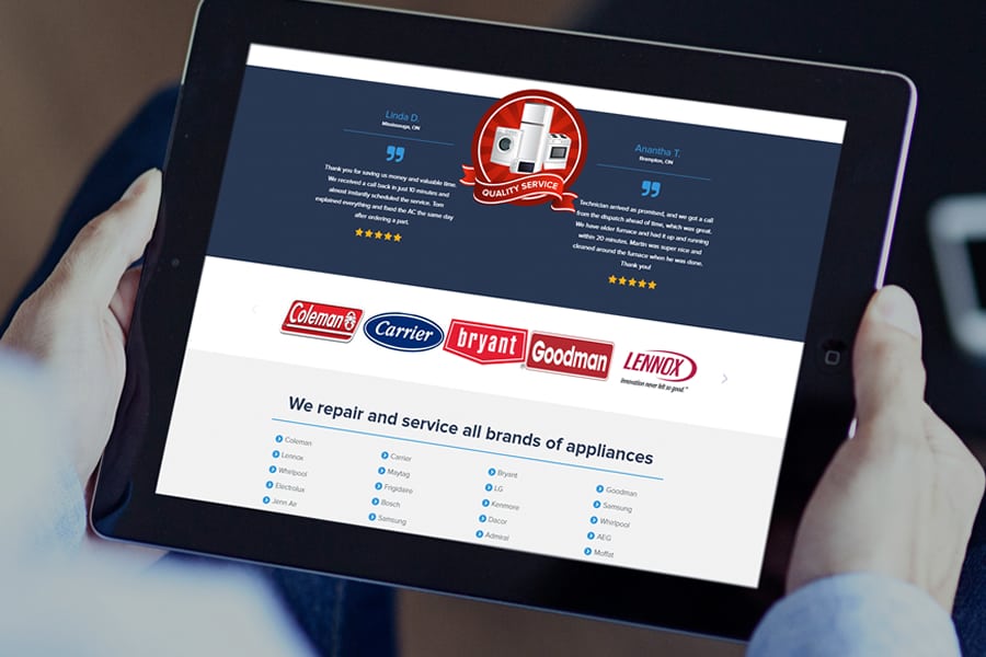
An important part of the page is the image menu where the visitor gets to pick the appliance they need repaired by visual recognition. This engages the visitor’s visual response, and recalls the sense of urgency of getting the repair done. The page has several different call-to- action messages, appearing intermittently across the page, to guide the visitor to make a call or register in the site form.

