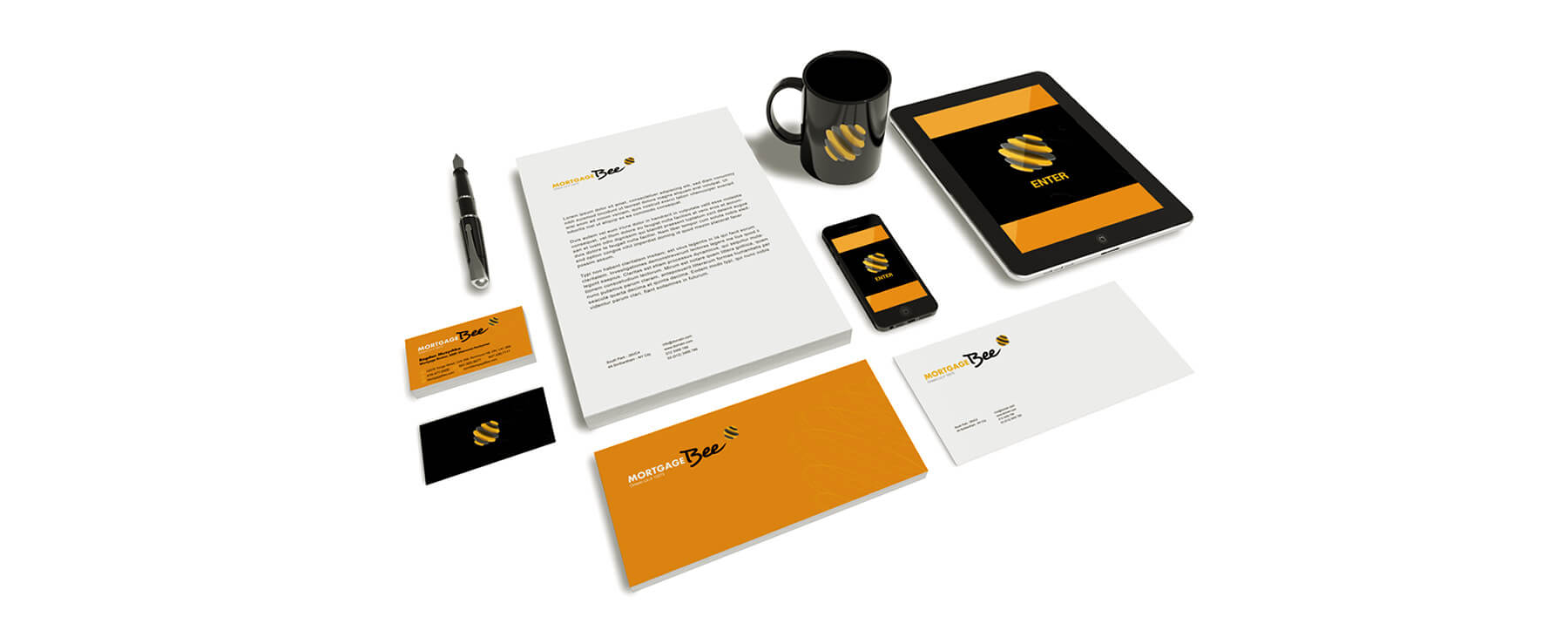
Like a honeycomb, our logo for Mortgage Bee is simple but deceptively complex. Circles of varying sizes — much like coins — are stacked to look like a hive. The colours alternate between black and gold, evoking the colour of honey and the iconic striping of a bee. But the image is titled on its x-axis so the circles overlap and show a 3-D edge, producing variation in shape and colour that gives the image depth and interest.
54
Mortgage Bee
Financial Services, Branding
Logo and Corporate Identity Design
As a new company in a somewhat crowded market, Mortgage Bee needed branding that would help them stand out. Convergine leveraged the company name to create a corporate identity both immediately recognizable and immensely memorable.


Logo


Identity

Our team played up the worker-bee connotation by emphasizing the seriousness of “mortgage” with a bold, blockish font in all caps. We combined this with a curvy, handwriting-like font for “bee” to evoke loopy, free-wheeling flight. Like the logo, the name uses a black and honey-gold palette. Separately or together, these elements immediately identify the company as one that works hard to get clients “sweet mortgage deals.”

