Benson Mortgage Investment Corporation

Financial Services, Branding

Logo and Corporate Identity Design

An offshoot of Benson Mortgages, Benson MIC needed a unique corporate identity that would still leverage its parent company’s excellent reputation. Using a blue palette similar to Benson Mortgages, Convergine created a simple logo that would distinguish Benson MIC while at the same time branding it as strong and dependable, just like its precursor.

Logo

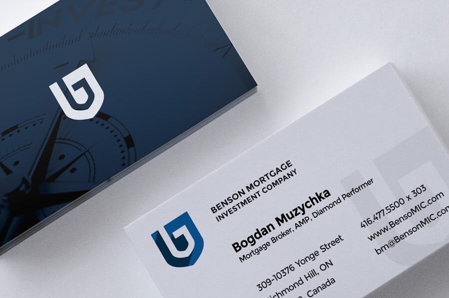
The Benson MIC logo uses a dark and royal blue similar to those in the Benson Mortgages branding. These hues represent strength and reliability, often invoking feelings of trust. To further these connotations, we shaped the logo like a shield, recognizable symbol of protection. As an added touch of interest and branding, we made the cut-out resemble a lowercase B for “Benson.”

mic4

Identity

Our designers set the company name in all caps using a sans serif font and divided it over two lines of equal length, forming a rectangle. About half the height of the logo, this rectangle was vertically centred next to the shield for a pleasing letterhead. The distinctive logo was also used alone as a sort of watermark on the stationery. Finally, we created a generic backdrop for print or digital use, setting a white version of the logo against a dark blue backdrop emblazoned with a compass, the universal symbol of guidance.