Benson Mortgages

Financial Services, Branding

Logo and Corporate Identity Design

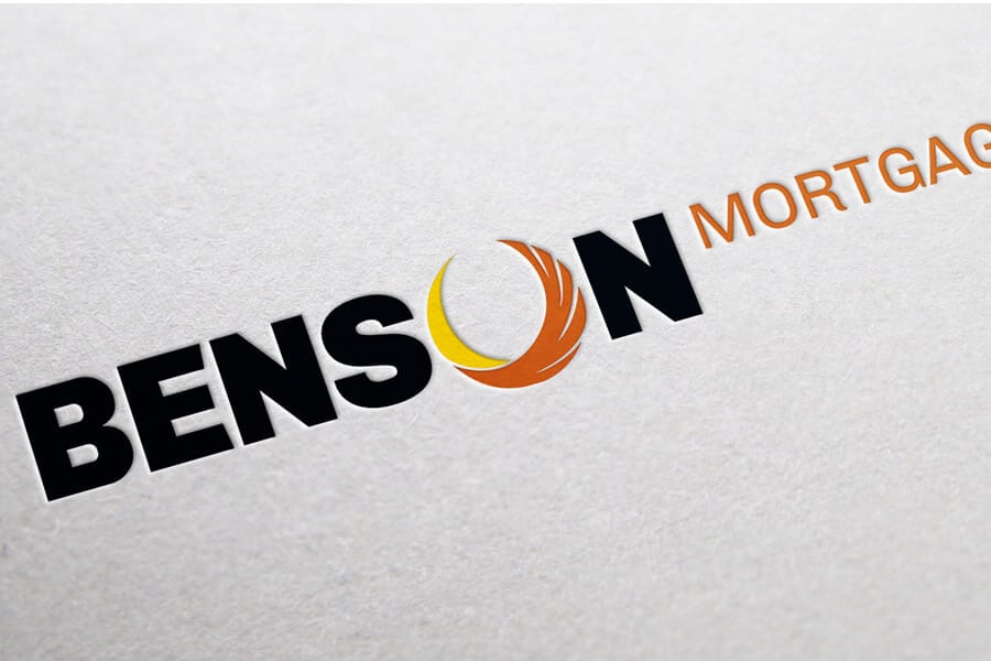
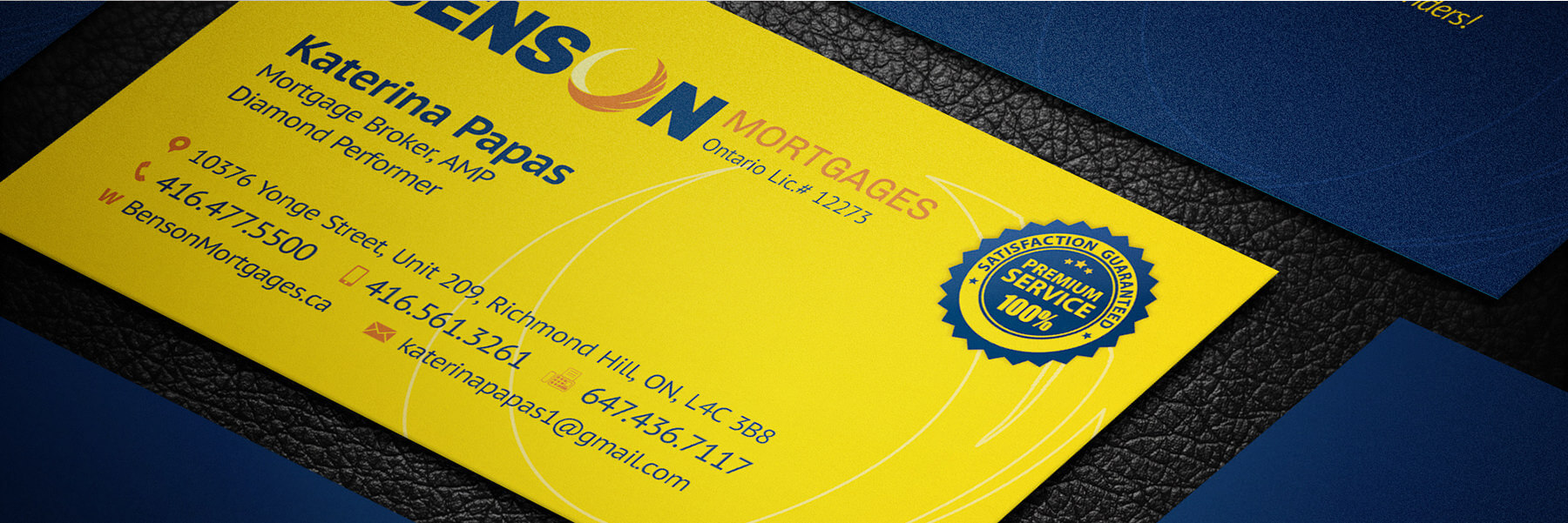
Benson Mortgages wanted a brand that would speak to its strength and reliability as an established company. Our designers used colour, type, and a single unique embellishment to convey this message simply but effectively.

Embellishment

With an established reputation, Benson’s name is its brand. To create some visual interest in the company’s marker, we embellished the O in “Benson” with a feather-like design. As with the colours and typeface we selected (see below), this adornment reinforces Benson’s brand message — feathers symbolize strength and tradition, as well as honour, power, wisdom, and trust.

Typesetting

Type is an important but often overlooked facet of design. At Convergine, we pride ourselves in using attractive, meaningful typefaces that reinforce the client’s corporate messaging. For Benson Mortgages, this meant something strong and staid. A bold, monospaced, sans serif font in all caps gives the name “Benson” weight, emphasizing the company’s influence and authority.

Colour

Colours are the main aspect of Benson’s branding. Blue, especially in a darker shade, indicates strength and reliability. Golden yellow evokes antiquity and signifies tradition or permanence. Brownish-orange is associated with earth and warmth. It speaks to steadfastness, wholesomeness, and dependability. Together, these colours create a complementary palette that also speaks to Benson’s reputation.