1

Brama Telecom

Telecom, Branding

Logo and Corporate Identity Design

Brama Telecom came to Convergine because they needed a new corporate identity — one fit for a company on the leading edge of technology in home phone, TV, and Internet services. With a keen understanding of line, shape, colour, and balance, our designers knew exactly how to create a fresh, modern look for the brand.

Logo

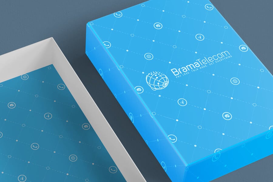
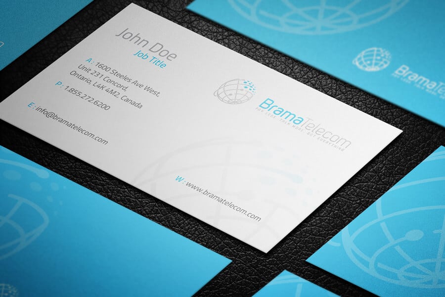
Brama Telecom’s services connect clients to the world around them. They are also simple to get and easy to use. To portray these ideas, we used a line-drawing of a globe, modified so that the top right quarter is completed with disconnected circles. A palette of grey and light blue speaks to the sleek sophistication of technology combined with the basic simplicity of the services.

Identity

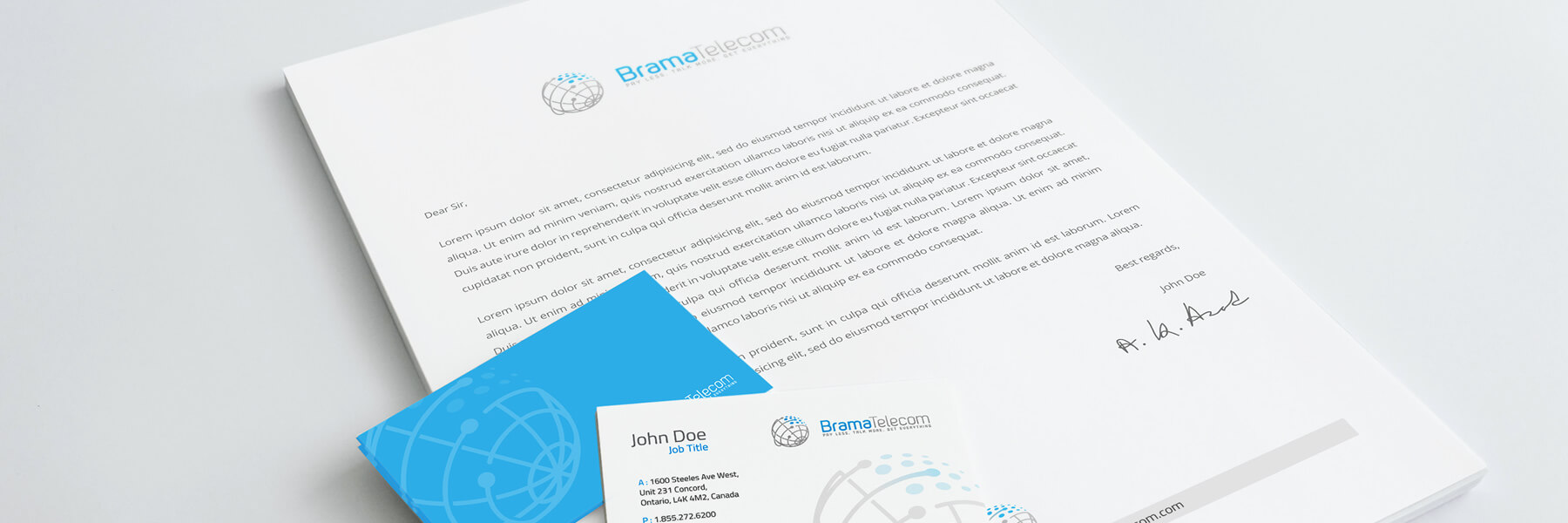
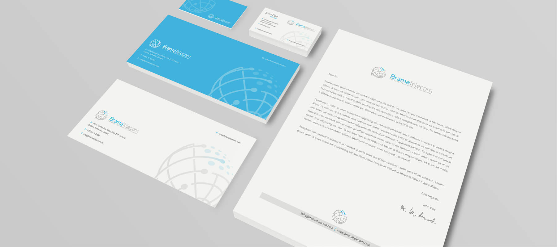
We chose a rounded, sans serif font in grey and light blue for the company name. For the slogan, we went with a blockish sans serif font to give an electronic feel, which we enhanced by using all capitals and only grey. These choices echo the simplicity and sophistication of the logo for a cohesive design Brama can use on all of its materials.

Conversion

To fulfill the calls to action and turn visitors into customers, our experts created a simple, user-friendly ordering process. The same image-rich approach as on the product pages allows users to understand options quickly. Clients need only click to customize their orders as they’re guided through the process step by step.