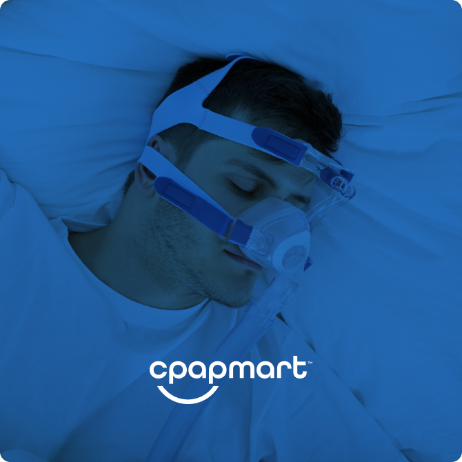
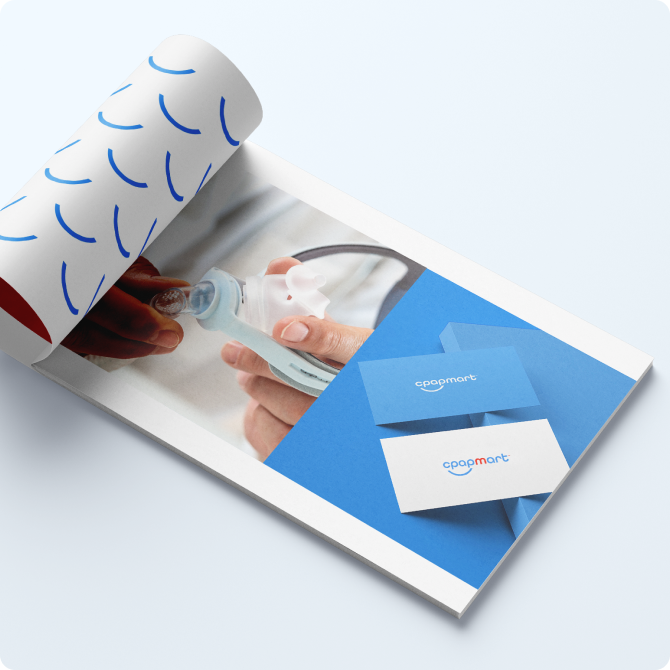
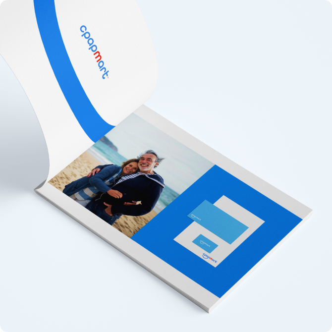
Our client CPAP Mart is a professional healthcare provider and Continuous Positive Airway Pressure (CPAP) equipment supplier. CPAP equipment helps people breathe easily, especially at night, solving multiple health issues. The company decided to expand its online presence and go e-commerce for the CPAP equipment under the new brand. They approached us to create a new brand identity and develop a style for the new company.
Concept
The client’s vision was to ensure that their new brand conveys simplicity, clarity, and positivity. First, we worked on the proper name for the new business. After in-depth research and multiple discussions, the client selected the name CPAP Mart.

Logo and distinctive style
Once we agreed on the name and the brand style, we started working on the logo. After multiple reviews and discussions, the client appreciated and accepted the final version that fully reflected their vision and requirements. The logo is simple, straightforward and relatable to the company’s core expertise. The arch under the logo resembles a smile and adds a touch of joy and positivity to the rather conservative healthcare industry.
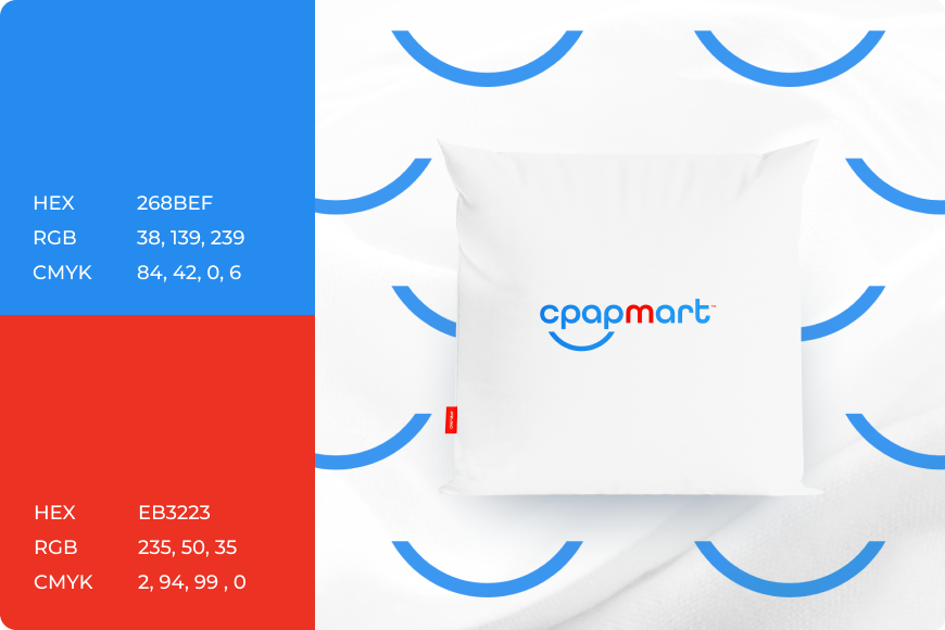
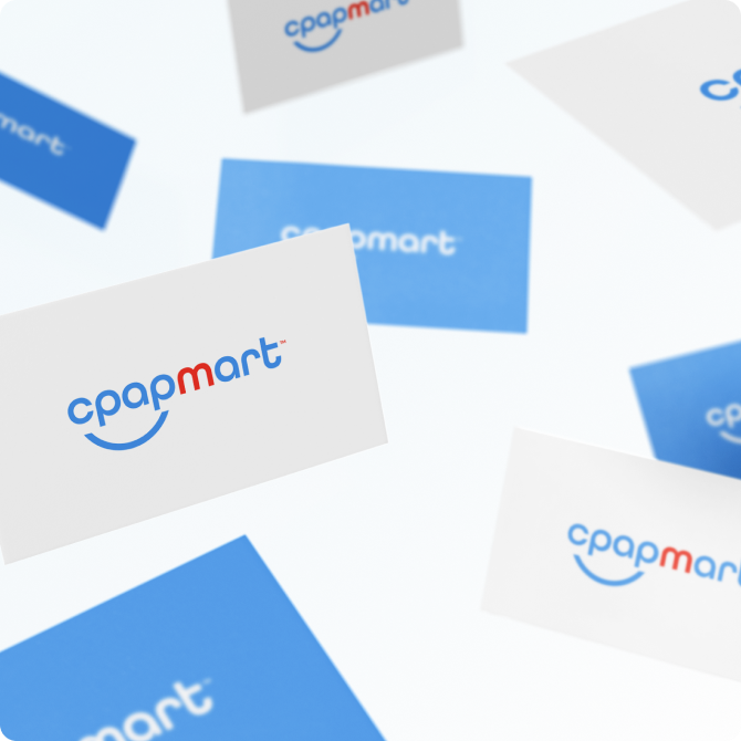
For colours that are usually associated with air, we suggested navy and bright blue. A drop of red colour on the logo separates CPAP from ART creating an interesting combination of words that reflect the company’s expertise and experience: CPAP, mart, and art.
Brand roll-out and style guidelines
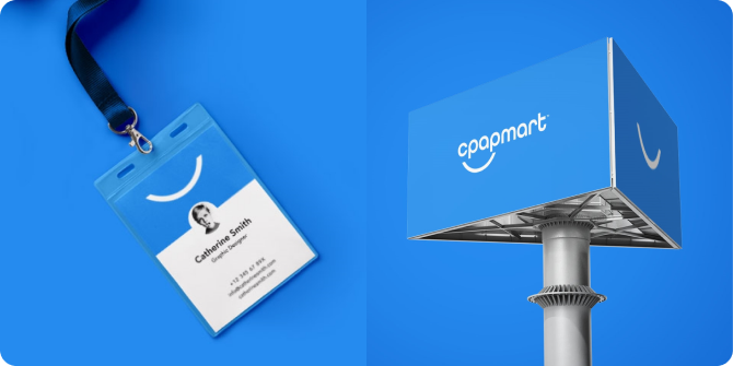
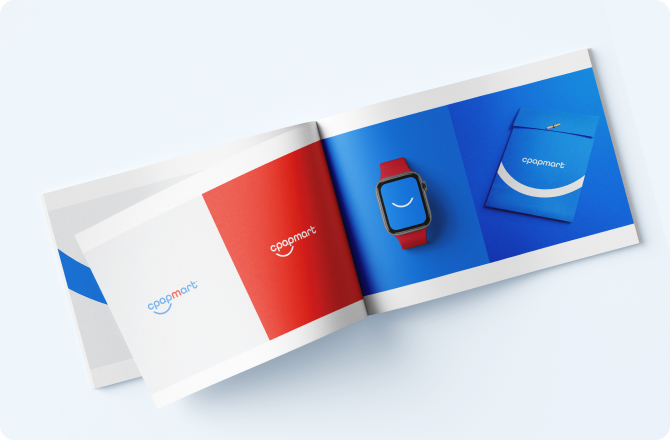
We expanded the new style application across various marketing channels and brand assets including website, social media, collateral, stationery and others. At the end of the project, we handed over to the client a brand book that clearly outlines the style guidelines and standards. The CPAP team can use these guidelines to create and maintain the brand identity to establish a long-standing connection with its audience.
