WhyFly

Not-for-Profit, Branding

Logo and Corporate Identity Design

WhyFly’s ultimate goal is to prove that flying is the safest mode of transportation. Their immediate objective is to fund a documentary about safety concerns in civil aviation and the modern technologies used to build and test planes. Knowing that awareness is the first step to fundraising success, project leaders turned to Convergine for a winning brand.

Logo

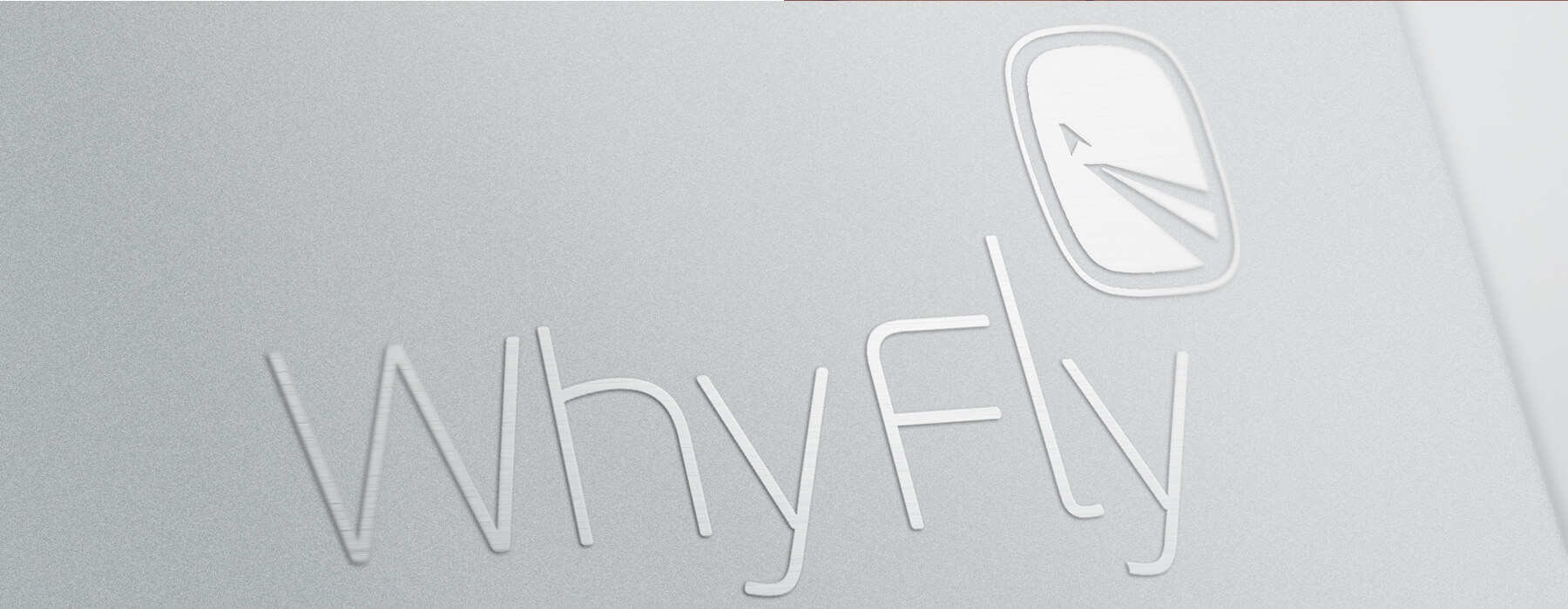
When it comes to logos, we at Convergine know that less is more. Three simple elements make up the WhyFly Logo: a round-cornered square reminiscent of a plane window, an inverted V spanning the bottom right quadrant, and a chevron just above the point of the V, suggestive of a plane taking flight.


Colours

White and light blue are obvious choices. Not only do they bring to mind the sky, but they also prompt feelings of peace, well-being, and trust. People are more likely to donate if they feel good and believe the recipient is reliable. As an added bonus, the brightness and contrast draw and please the eye, respectively.

Identity

With a memorable logo and meaningful colour choices, WhyFly had a simple yet effective brand. Our next step was to employ variations of the brand on several identity items that project members could use to raise awareness and begin promoting their efforts.