YarnCrate

Retail, Branding

Logo & Corporate Identity Design

As a new business entering the competitive retail market in a relatively narrow niche, YarnCrate needed a strong corporate identity to help them stand out and attract their target audience. Thanks to a proven client consultation process and extensive branding experience, our team was able to create a logo, slogan, and typeface that did just that.

Logo

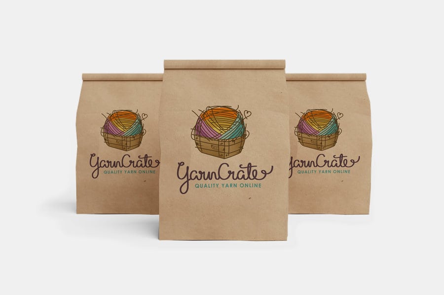
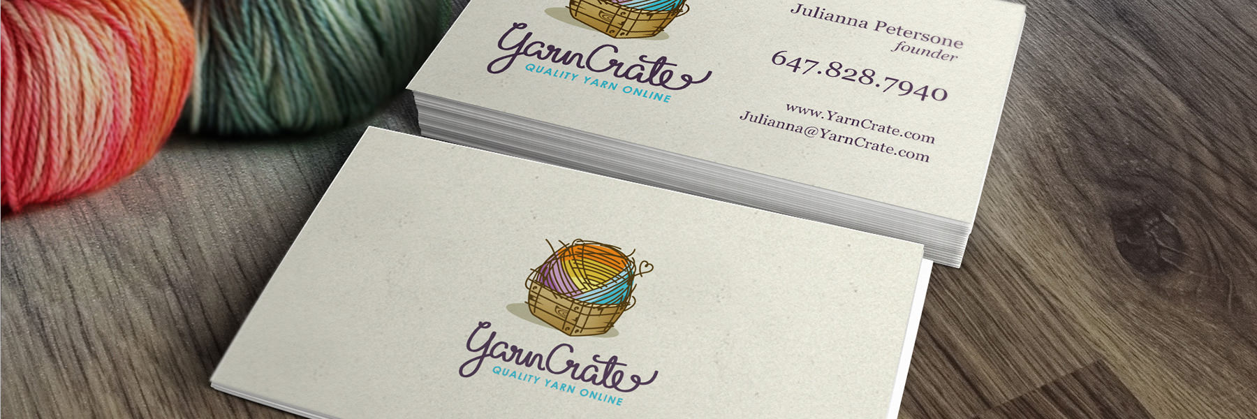
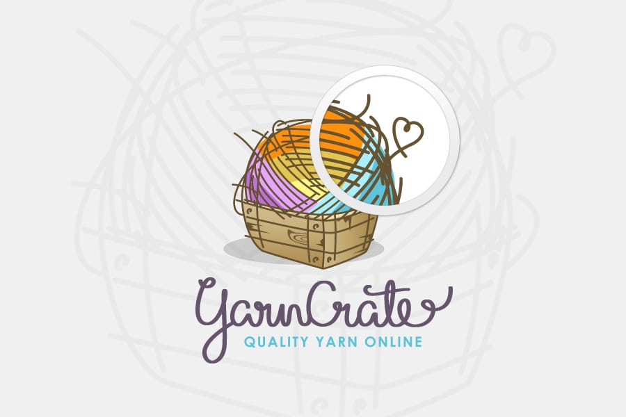
With a name like YarnCrate, a ball of yarn in a crate was a given for the logo. The trick was to stylize these elements so they’d be fresh and distinctive. Four bright, complementary colours—two primary and two secondary—add interest and draw the eye. Seemingly slap-dash lines around the edges create a contemporary look of contrived haphazardness. And the heart detail adds a whimsical touch while emphasizing that the company cares.

Slogan

Because YarnCrate has such a niche product, they needed a slogan that would speak to their competitive advantage. Through guided discussions with the client, we identified two key attributes: the quality of their product, and the convenience of their online retail format. Thus, the slogan “Quality Yarn Online” was born. It isn’t Shakespeare, but it’s simple and straightforward and speaks to brand benefits — all the hallmarks of an effective tagline.

Typeface

The goal of any brand is to become a household name, so how that name is written is an essential part of branding. We chose a loopy, flowing font for YarnCrate because it looked as if the name itself had been spelled out in yarn. The fanciful, lighthearted feel was also befitting of a brand in the creative arts industry.