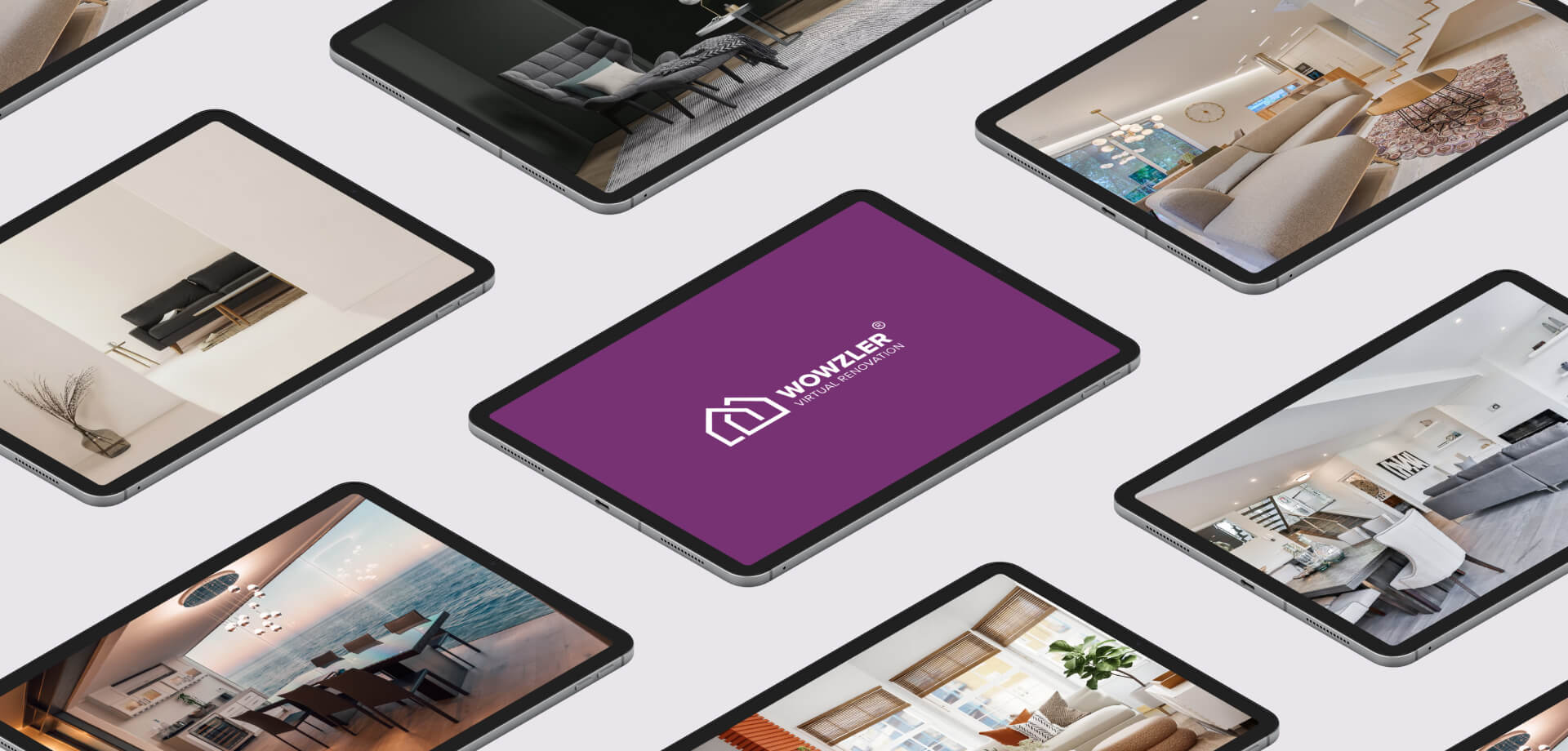
Wowzler provides homeowners and real estate agents with a virtual solution that dramatically improves the buyer’s first impression in a very modern way. Instead of costly physical renovating a home or condo for sale, Wowzler offers a complete virtual renovation and remodel, transforming old spaces into modern, fully furnished, and professionally designed interiors. Such an innovative approach helps potential buyers to visualize an interior while saving money to the property owner.
Concept
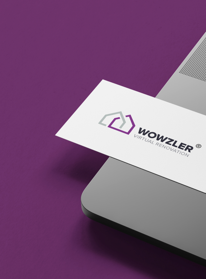
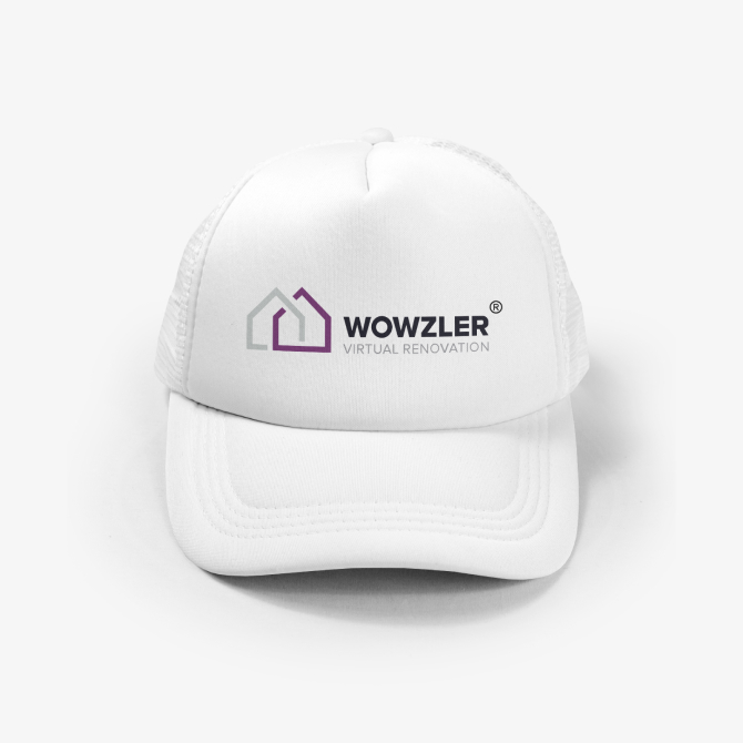
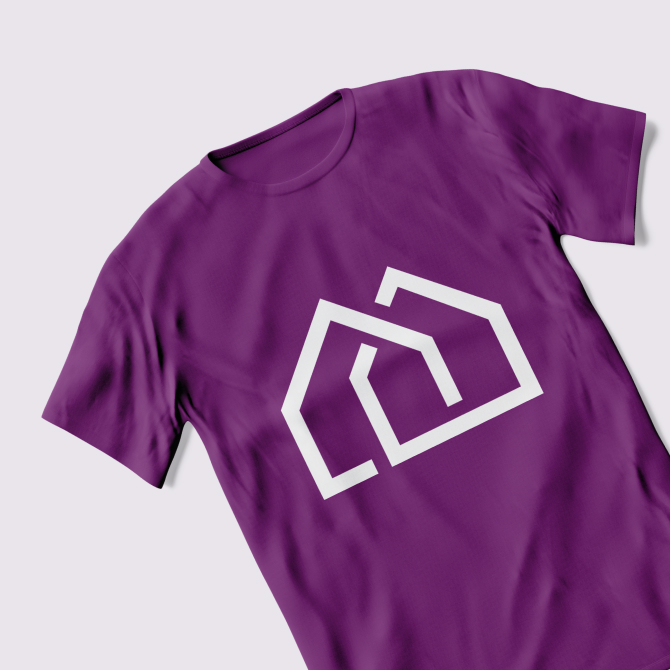
Before working with Convergine, Wowzler had a basic landing page and a simple text logo with the company’s name. We had to work on their new brand identity and its supporting visual assets to reflect the essence of the business in a simple relatable way. First, we developed a new creative concept for their logo to communicate the company’s innovative solution and appear credible to potential users. The Wowzler’s new logo conveys transforming an old average house into a modern, bright, and professionally designed one. It is based on simple house shapes that clearly identify the industry target market and illustrate the brand’s essence – transformation.
Typography & Color Palette
We selected light grey, black, and bright purple as the base colors. Light shades were suggested as a secondary colour depending on the context. A powerful contemporary font with bold lines and sharp edges was chosen to communicate strength and instill a trusted brand image.
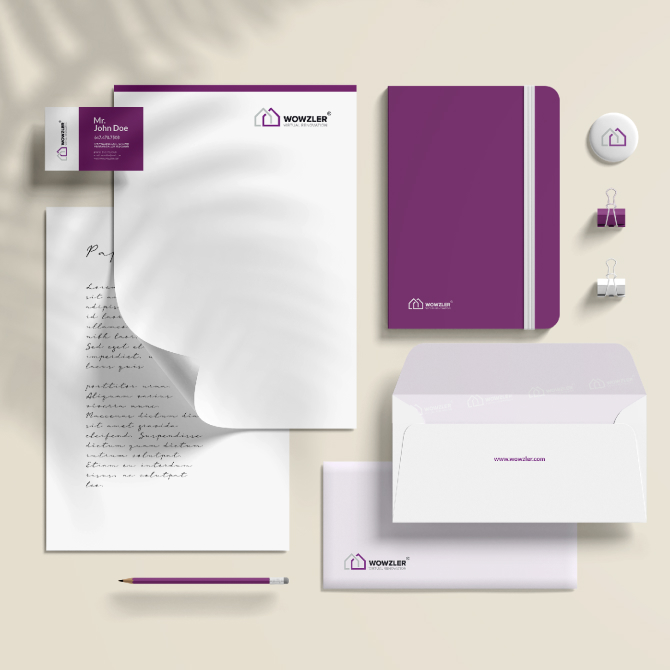
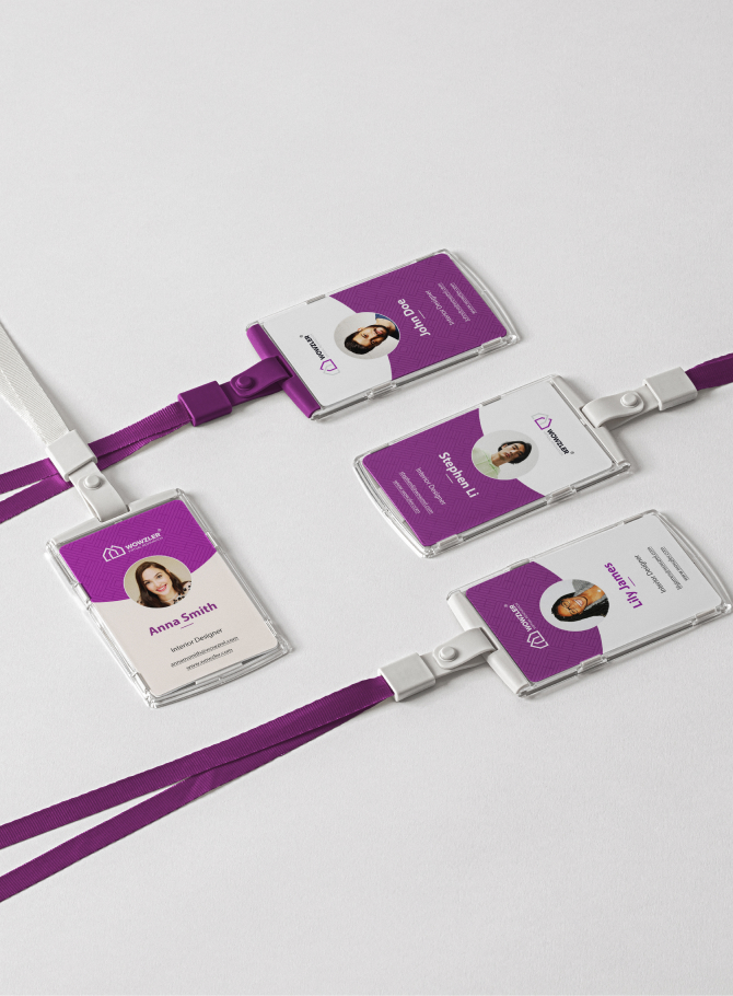
Visual Assets and Style Guide
As a part of deliverables, we developed brand guidelines for applying new identity and style across different media channels. As a continuation of the project, the new website design will also be based on a fresh identity.
