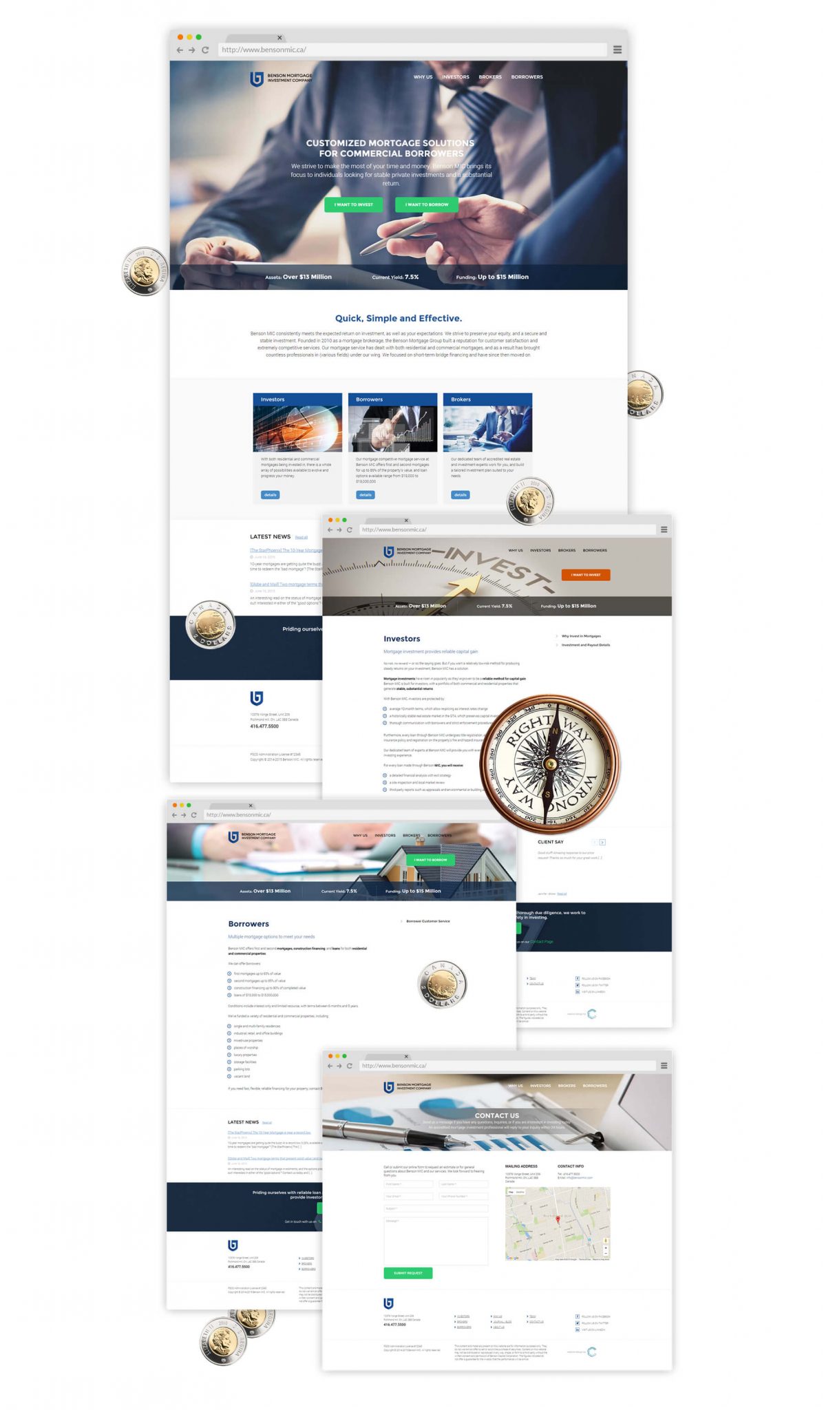
A grid-like design keeps the look sleek and contemporary. It also makes content easy to read and streamlines information for the company’s three target audiences: investors, borrowers, and brokers. Block capitals in a sans serif font attract attention to headlines, menu tabs, and action buttons. A simple blue and white colour scheme punctuated with pops of complementary colours creates a contemporary yet timeless design.
Website for Benson MIC
October 17, 2015
When you’re handling people’s money, you need to appear credible and trustworthy. Benson MIC turned to Convergine to create a website that would convey their solid, distinguished reputation to clients and potential investors. With a grid-like layout, strong sans serif font, and simple blue-and-white colour scheme, we created a website to highlight the company’s reliability and advantages.
Bensonmic.ca


Benson MIC has three key audiences: investors, borrowers, and brokers. A simple site structure allows them to speak directly to all three markets without cluttering the site or confusing the content. Users can access the appropriate content either through the main navigation menu in the top right or via callouts on the homepage. Content and calls to action in each section speak directly to the particular needs and concerns of each group.


In addition to targeting content specifically to each of Benson MIC’s audiences, we contracted a web content specialist to produce clear, informative content that would suit online reading habits. Bulleted lists and bolded key points allow users to scan the pages and glean important information quickly. A dark sans serif font on a white background makes on-screen reading easier, and a secondary navigation menu on the right-hand side of each page lets users drill deeper into content as they wish.

