Featherlight Design
Website Design for
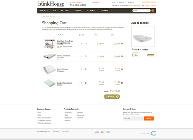
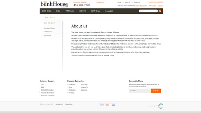
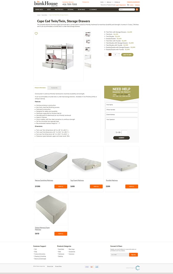
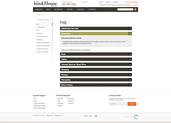
BunkHouseKids
September 18, 2017
This website creation project is unique in the family of dental clinic brands - as unique as the Oakville Dental Arts clinic itself. The soothing spa atmosphere of this unusual, high class dental practice had to be clearly reflected in every aspect of the website created to represent it.
bunkhousekids.com

Instead of traditional imagery displaying dental equipment, technicians at work or images of dentures, crowns and healthy teeth, we focused on creating a featherlight feeling of perfect weightlessness. The dancing ballerina in the background video is there to emphasize this very effect.
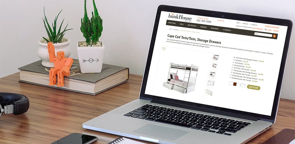
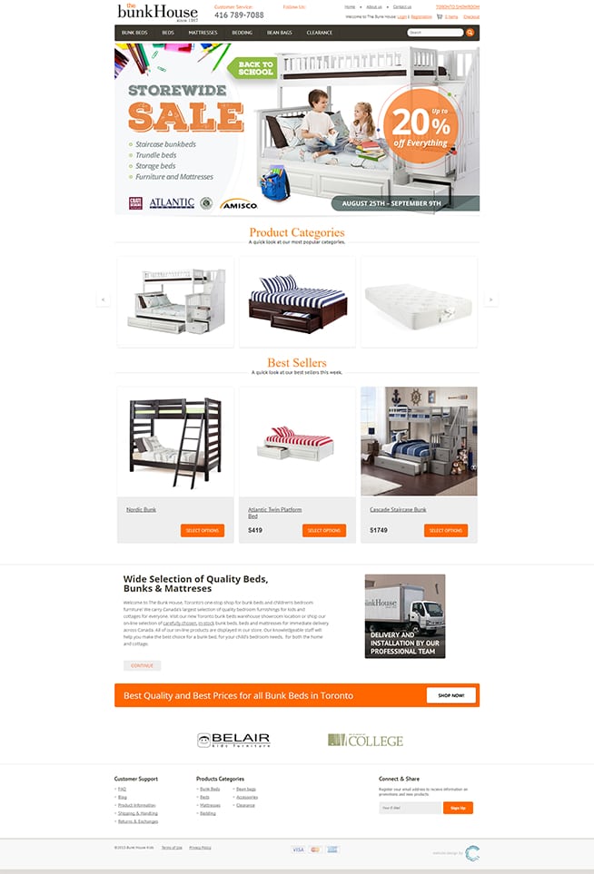
Best Prices for
all Bunk Beds in Toronto
“We carry Canada’s largest selection of quality bedroom furnishings for kids and cottages for everyone

Color and Typography
To further promote the brand as a Dental SPA, we stepped away from the traditional blue-and-white color palette. Instead, we chose to work with a set of gentle browns and teals on soft beige backgrounds. Some of the sections have a subdued image in the back, creating depth while not interfering with readability. This feeling of ease is further emphasized by the use of cursive fonts for headers, setting it once more apart from other dental practices.
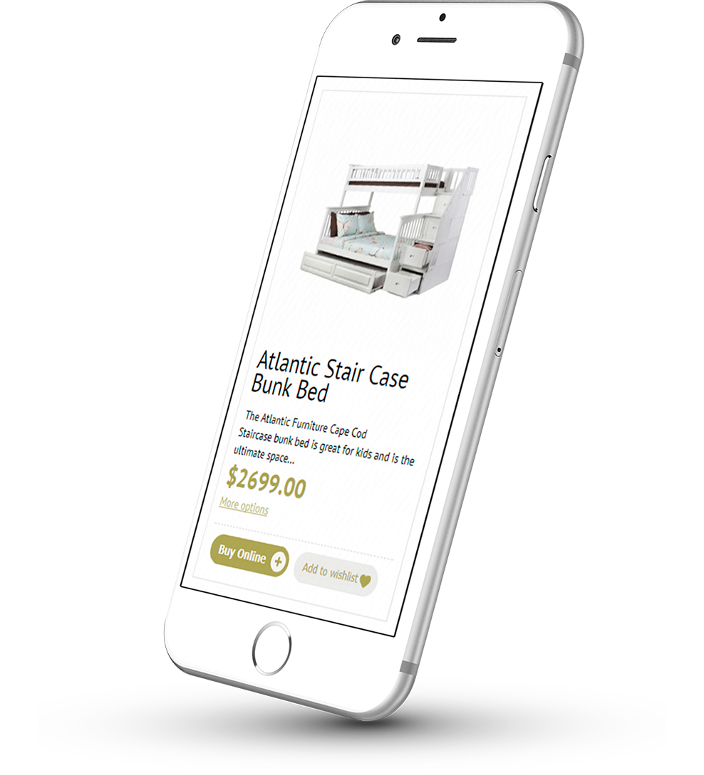

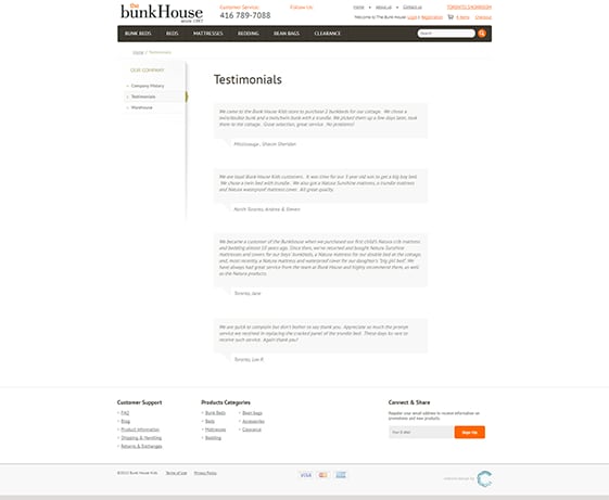
Clear and Readable Layout
At the same time, the site is crisp and clear, using sharp images and clear text on white backgrounds for perfect readability. This clear-cut design also helps the site be perfectly mobile-friendly, an important aspect for busy people looking for a local dentist on the go. .
