Website for TheCCSGroup

July 18, 2016

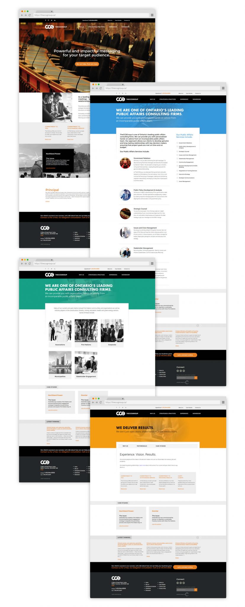
TheCCSGroup is one of Ontario’s leading public affairs consulting firms. Unfortunately, their outdated website didn’t really represent their professionalism and expertise. Convergine designed a new website with strong branding and straightforward content better aligned with the organization’s stature and achievements. The result is an online presence as impactful as TheCCSGroup’s services.

theccsgroup.ca

Colour Scheme A base colour palette of black, white, and grey reflects the seriousness of what TheCCSGroup does and the industries and organizations it works with. The contrast between black and white works functionally to draw the eye and make reading easy, while also alluding to the metaphorical “black and white” of government, policy, and law. Pops of a deep orange add interest and highlight headlines, links, and calls to action.

Design Elements

A dominant picture of the parliament buildings quickly situates TheCCSGroup in the public affairs arena. Colour is used strategically throughout the site to draw the eye, while the majority of images are in black and white. Linked images appear in colour when selected. A grid-like page layout with content in squares and rectangles is reminiscent of the printed page and the formal documents TheCCSGroup creates.

Site Structure A key element of TheCCSGroup’s service is communication with busy, high-powered professionals. We created a simple site structure that would deliver content in chunks and provide multiple pathways for users to find the information they want, and only the information they want, so that they can take action. Buttons and links throughout the site help users take the simplest path through a variety of content and contact TheCCSGroup at any point.