Our research mostly focused on audience preferences, types of imagery that works best and competitor analysis. It was important to follow the industry’s best practices while setting the client apart, or rather above the competition in a bold, meaningful way. The things we decided to emphasize are product display and an easy, intuitive checkout process.
Website for PISTIL FLOWERS
January 13, 2016
PISTIL Flowers is a company that offers high quality service and a variety of artistic arrangements to satisfy high-end clientele. The market they work in is extremely competitive, and we had to produce a website that goes far beyond an online gallery. It had to be an exceptionally effective marketing tool that brought the maximum amount of visitors to the point of sale.
pistilflowers.com
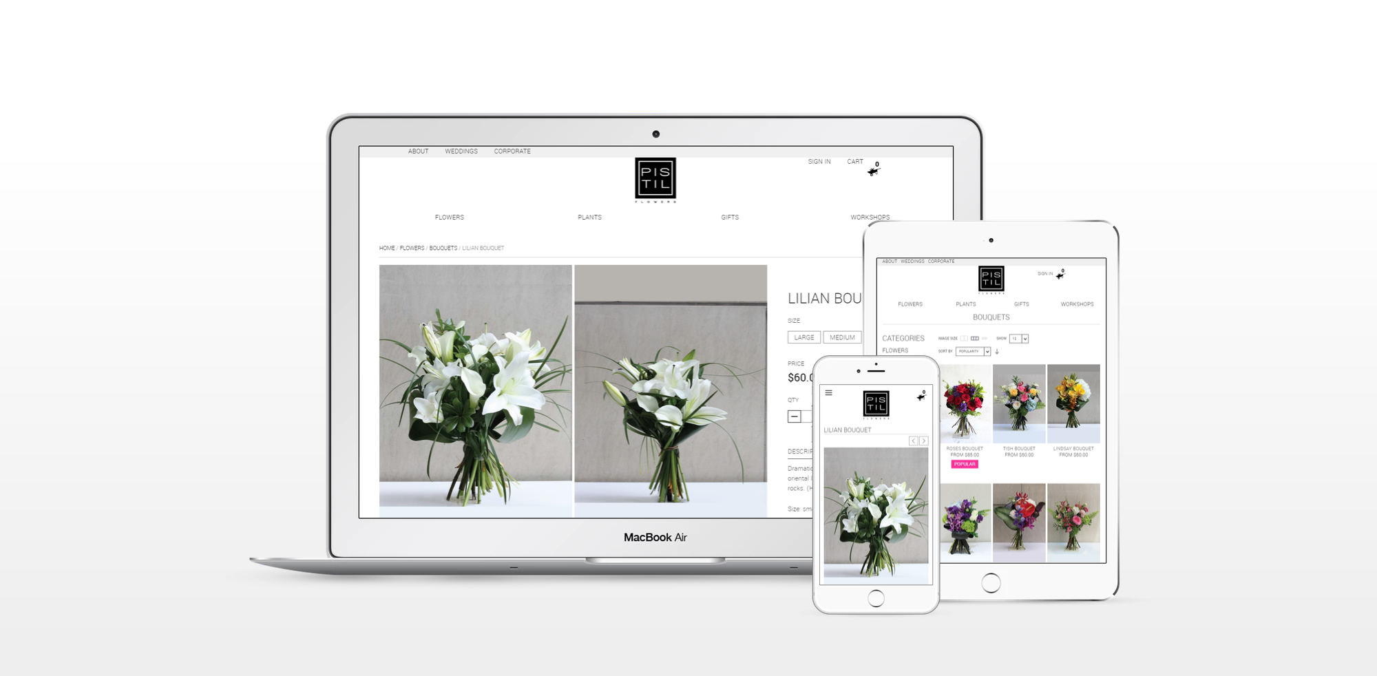
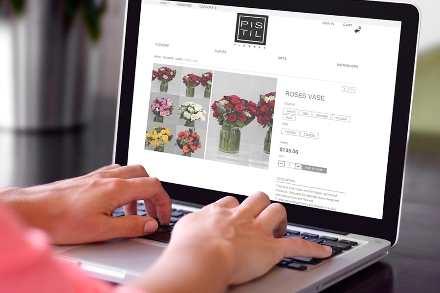
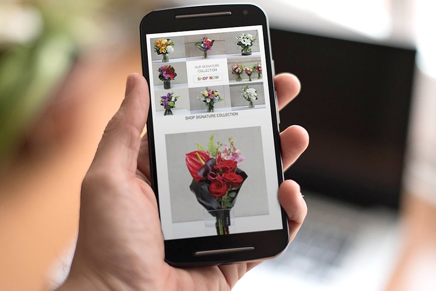
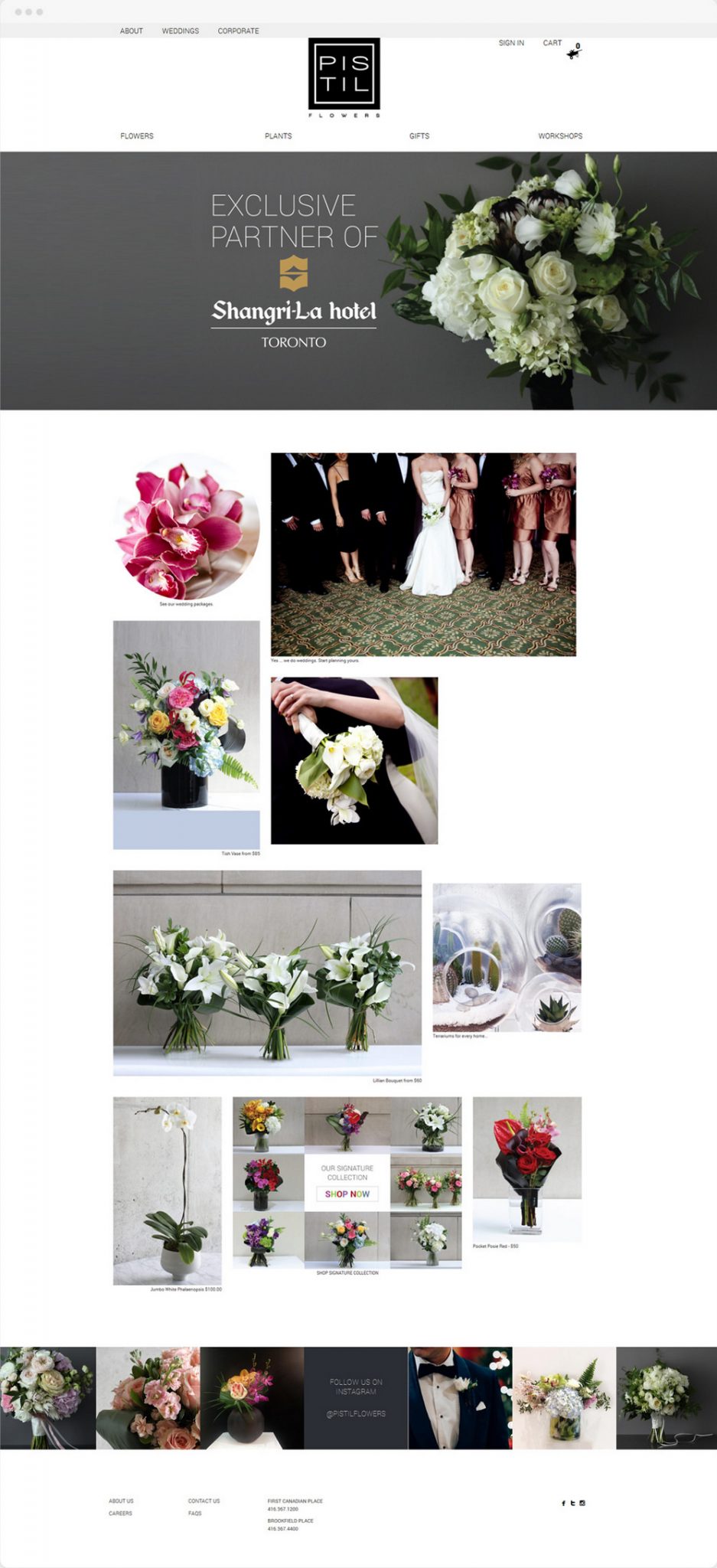
The User Interface we decided to go for is an image-focused online gallery with lots of white space around the vivid pictures of flowers and arrangements. The text is a soft, light grey sans-serif, visible enough to read comfortably yet non-distracting as to allow the visitor to enjoy the joy of flowers displayed on the photos.
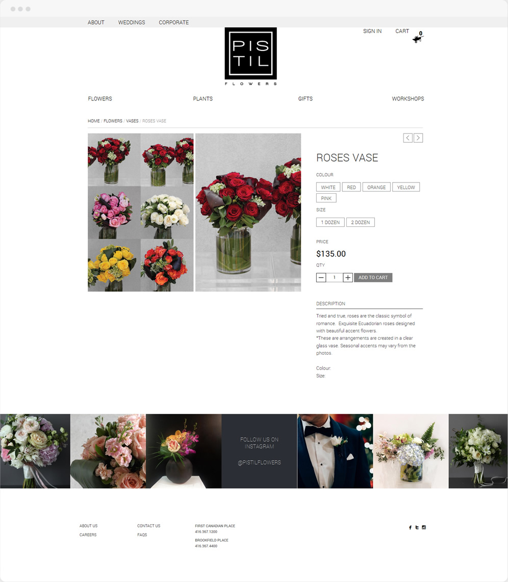
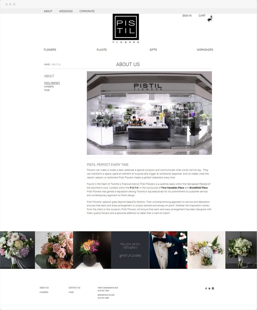
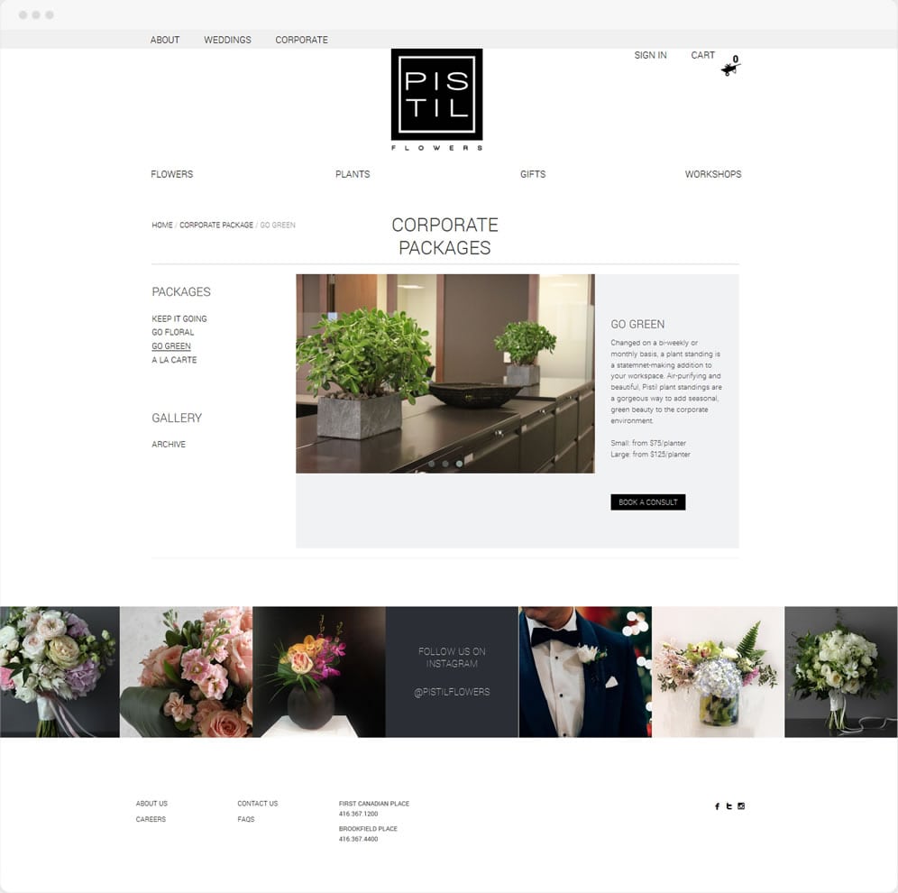
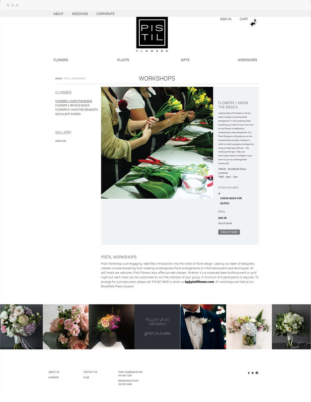
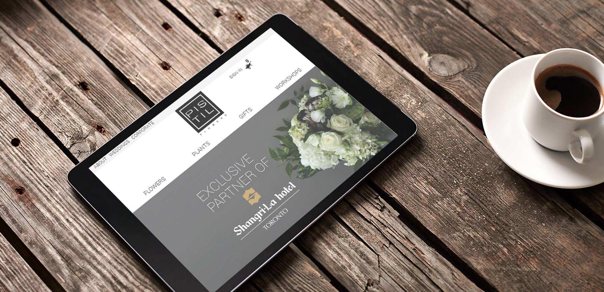
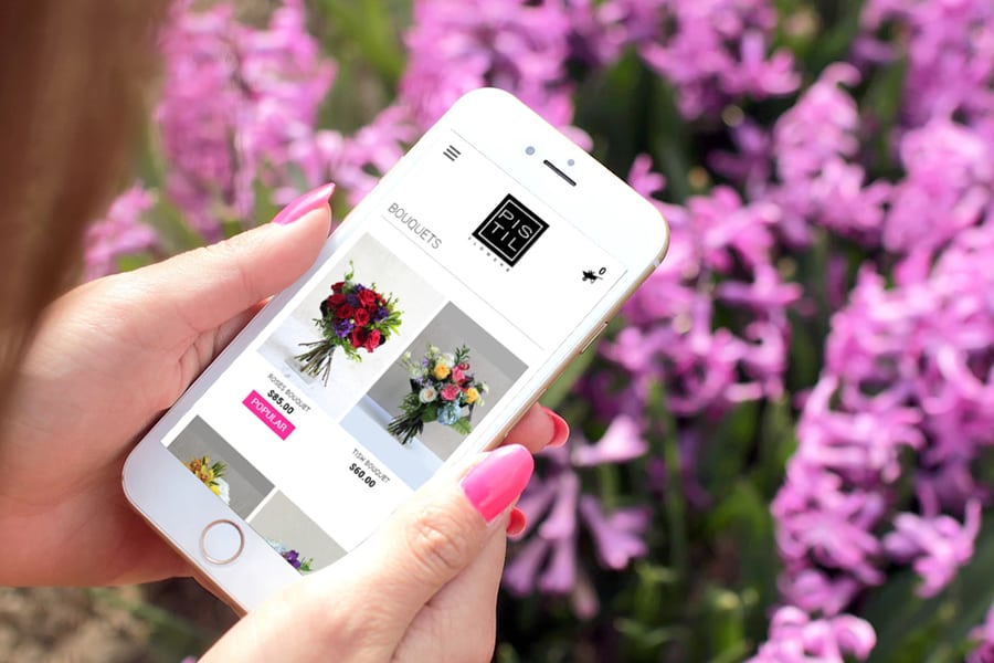
The checkout process is perfectly linear, with a shopping cart displayed on top of the page and an easy, one click item adding process. The website’s layout is scalable to display perfectly on small and large screens alike, making shopping on the fly easy and pleasant.
